Papa Inc. Improved Service Requests

Papa Inc. Improved Service Requests

Papa Inc. Improved Service Requests

Context

Care coordinators at Papa Inc. operate in a high-stakes, high-volume environment, routing patient service requests, tracking urgent needs, and managing care pipelines in real time. The existing internal dashboard was functionally adequate, but architecturally fragmented. Every decision required navigating away from the task at hand. The platform was slowing down the people responsible for patient care.

The Problem

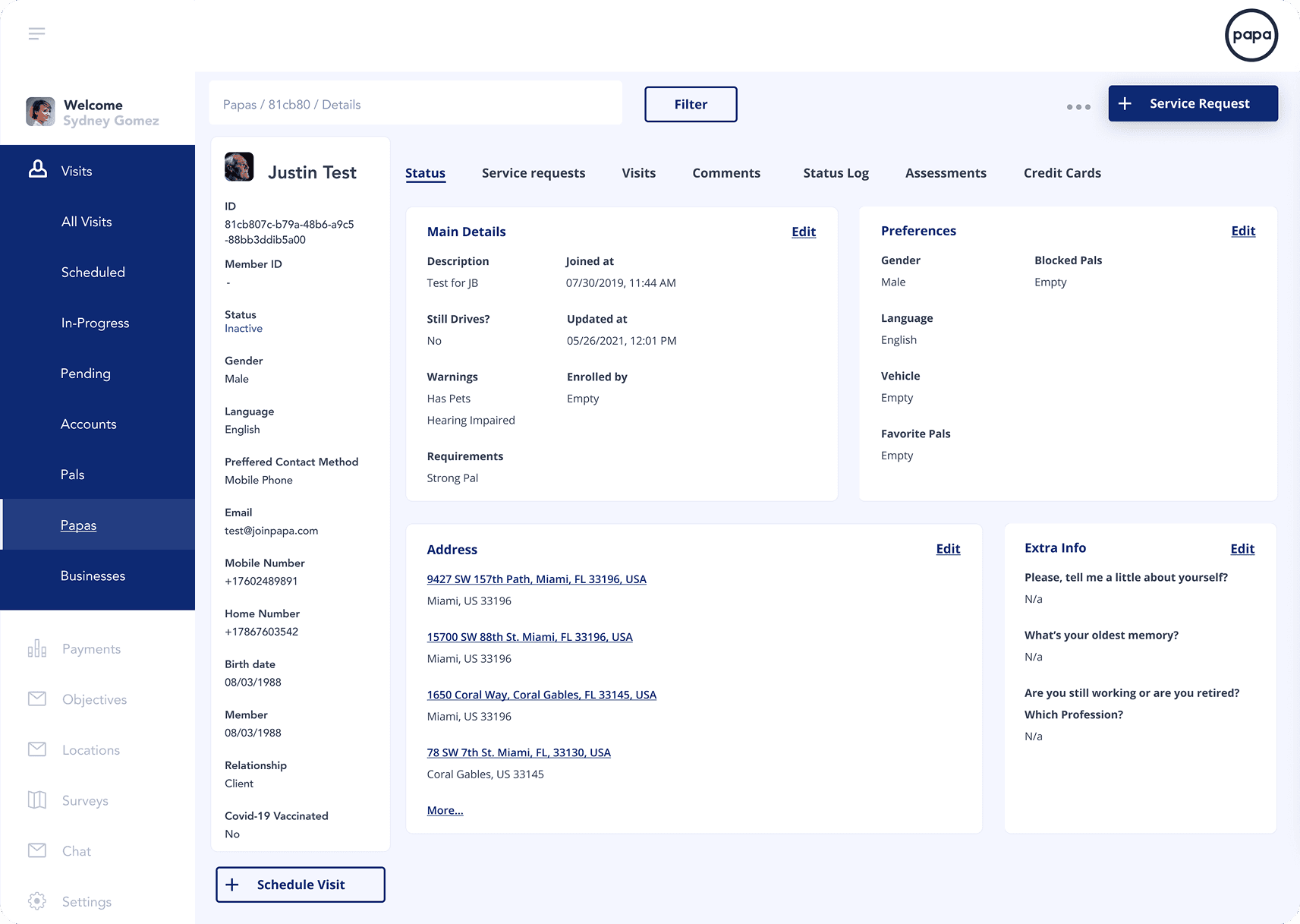
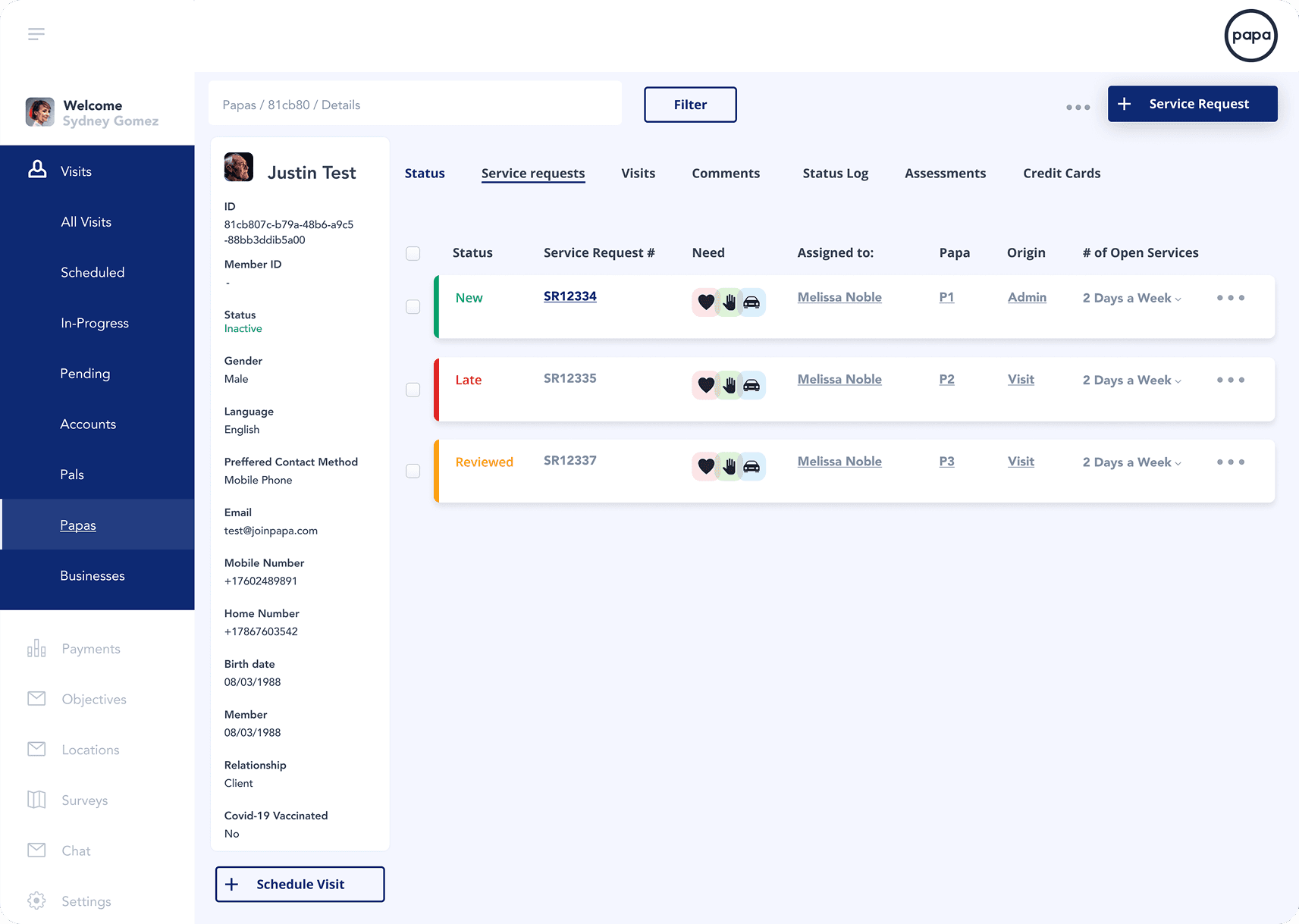
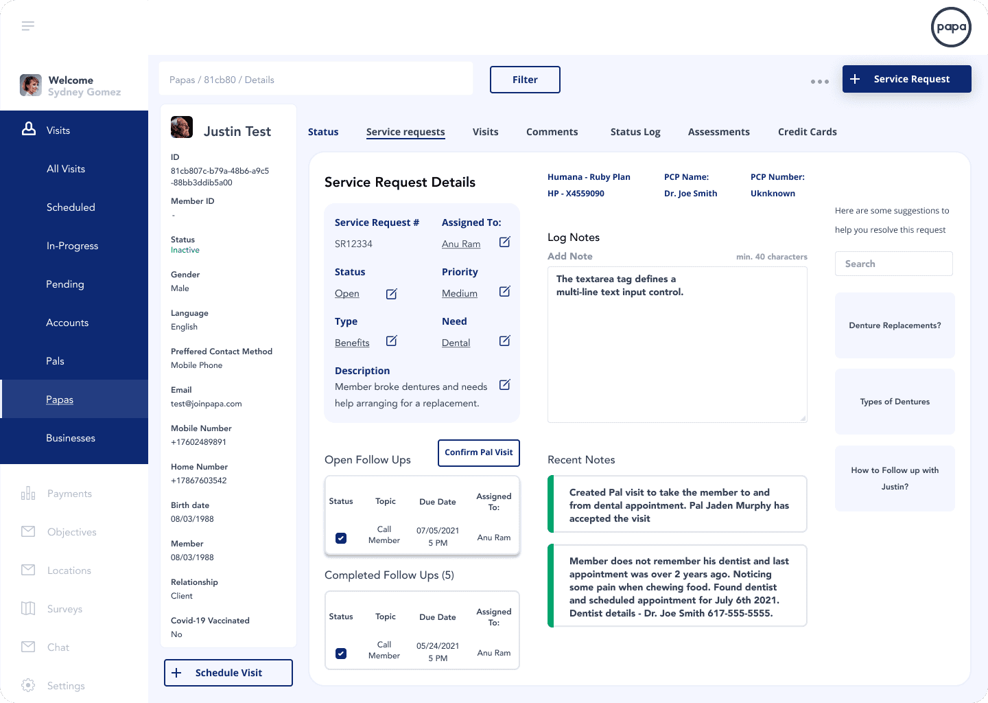
The legacy interface forced coordinators to treat a single workflow as five separate tasks. To route one service request, a coordinator had to visit multiple sub-pages to retrieve a patient ID, confirm their health plan, check their care history, and verify availability, all before taking any action. Mission-critical context was never in the same place twice. Urgent requests were buried. The interface was costing coordinators time they simply didn't have.

The Process and What I Owned
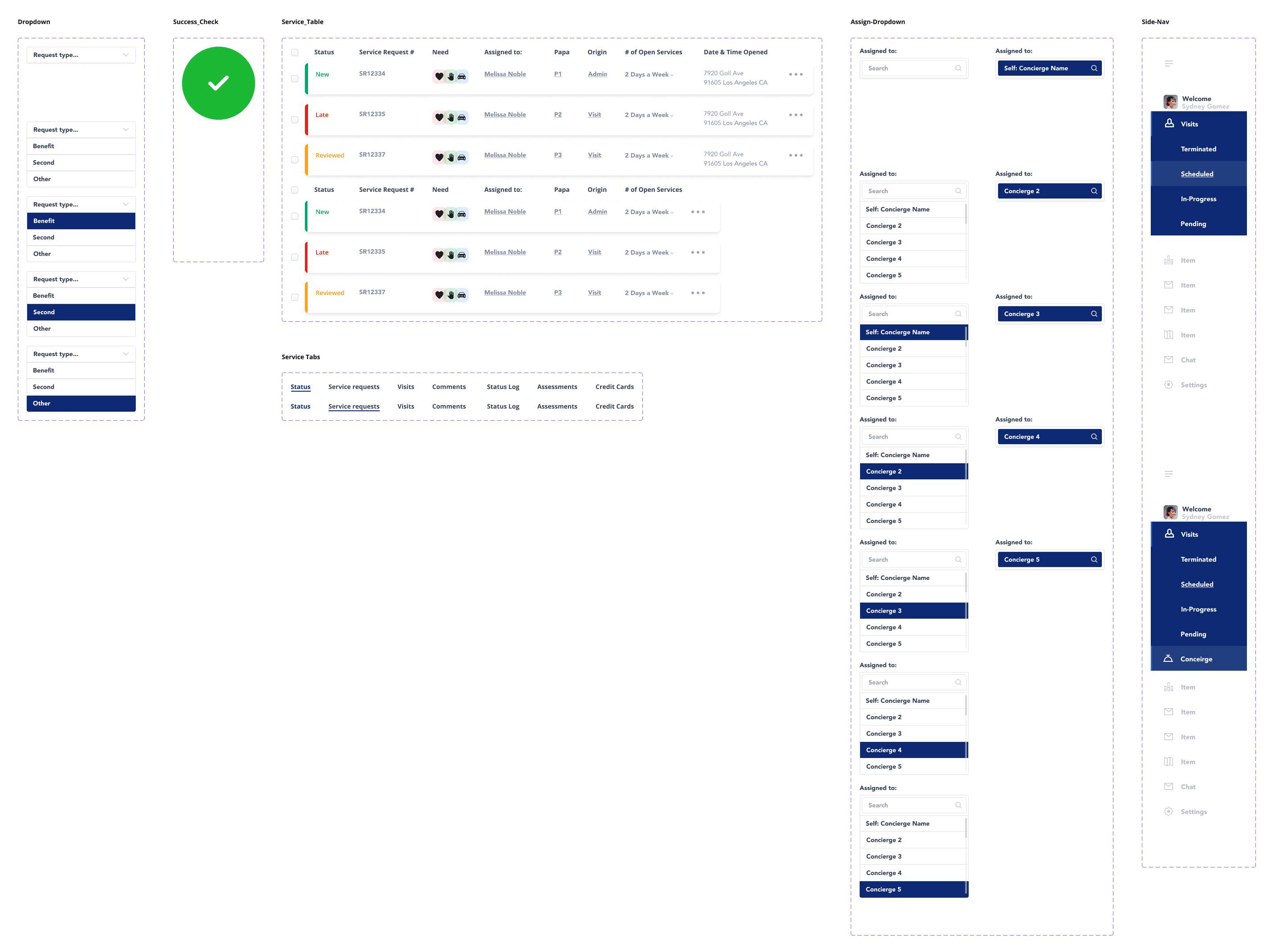
I partnered with the Lead Product Designer to redesign three mission-critical coordinator flows from the ground up: Service Request creation, Service Request management, and Concierge assignment. I led rapid ideation, wireframing, and high-fidelity prototyping. In parallel, I matured the existing UI component library — prototyping full variant sets for Priority indicators, Status labels, and dropdown interaction states, and aligning component naming conventions directly with the engineering codebase to enable a friction-free design-to-development handoff.

Results

35%

Reduction in time-on-task for patient routing

3

Mission-critical flows redesigned and shipped

Design-Dev Parity

Component naming aligned to the engineering codebase, eliminating handoff friction.

Detailed Background

The Papa platform supports an internal team of care coordinators whose work directly influences patient outcomes. The dashboard they relied on was built for functionality, not for the cognitive demands of their workflow. As the volume and complexity of service requests grew, so did the invisible tax the interface placed on the people using it.

The redesign wasn't about aesthetics. It was about acknowledging that an interface which creates cognitive friction in a healthcare environment isn't just inconvenient — it's a risk. Slower routing means delayed care. Missed urgency signals mean unmet needs. The design system holding the product together needed to grow up alongside the product itself.

Tools I Used

Team Size

Myself + 1 Lead Product Designer

Project Type

Product design, user research, design systems, rapid prototyping

Product design, user research, design systems, rapid prototyping

Product design, user research, design systems, rapid prototyping

My Role

UI Consultant - ideation, prototyping, UI kit development, design-dev handoff

Duration

2 Months

2 Months

2 Months

Client

Papa Inc.

Papa Inc.

Papa Inc.

What Principles Did I Lean On?

Rather than adding features to reduce friction, I focused on restructuring how existing information was presented, density without clutter, hierarchy without noise.


  • Contextual Persistence (Miller's Law & Cognitive Load Theory): The fundamental problem was that coordinators were forced to hold too much in working memory. Every navigation event was a cognitive interrupt. By anchoring patient-level context in a persistent left panel while task-specific content loaded on the right, we drastically reduced the number of items a coordinator needed to mentally track at once. The brain doesn't have to remember what it can always see.

  • Information Hierarchy Over Feature Addition: The instinct in product design is often to add. More filters, more views, more options. Our instinct here was to subtract, to decide what had to be visible at the top level and ruthlessly deprioritize everything else. High-priority alerts and patient identifiers surface immediately. Supporting detail lives one click deeper, not five pages away.


  • Design-Dev Parity as a Feature: A design system is only as strong as its implementation fidelity. I treated the component naming and variant architecture as a product deliverable in its own right. Aligning dropdown states, priority labels, and status tokens to engineering's naming conventions meant the design and the build were speaking the same language from day one.

Discovery & Research

Initial Understanding Of The Problem

Early conversations with the product team surfaced a clear behavioral pattern: coordinators were using the platform in a way it wasn't designed to support. They were treating the browser's back button as a navigation tool, moving forward to act, backward to retrieve context, forward again to complete the action. This pogo-sticking behavior wasn't a user error. It was a rational response to an irrational information architecture.

Key Findings

The most significant finding wasn't about a missing feature. It was about placement. The information coordinators needed most — patient ID, health plan, open service requests, urgency level — existed in the product. It just lived in the wrong places relative to where decisions were being made.

A secondary finding involved visual hierarchy within the service request table itself. Status distinctions between New, Late, and Reviewed requests were present but not immediately scannable. Coordinators were reading rows rather than triaging them. The interface was treating urgent and non-urgent requests as visually equivalent, which meant the urgency signal was only as fast as the coordinator's reading speed.

What This Told Us

The core design opportunity was not a new feature. It was spatial. Moving the right information into persistent view, and giving status signals strong enough visual weight to be processed pre-consciously, would change how coordinators experienced the entire workflow, without adding a single new screen.

The core design opportunity was not a new feature. It was spatial. Moving the right information into persistent view, and giving status signals strong enough visual weight to be processed pre-consciously, would change how coordinators experienced the entire workflow, without adding a single new screen.

Strategy, Ideation, & Prioritization

Defining the Scope & Vision

Vision:

A single dashboard where a coordinator could understand a patient's full context, triage their open service requests, and take action — without ever losing their place.

A single dashboard where a coordinator could understand a patient's full context, triage their open service requests, and take action — without ever losing their place.

Scope:

We focused the redesign on three interconnected flows:

  1. Service Request Management — The main Concierge dashboard, restructured around a Master-Detail split-view. The left panel anchors persistent patient context; the right panel handles task execution.

  2. Service Request Creation — A modal-based creation flow with a structured form: request type dropdown, need checkboxes, free-text description, priority selector, and concierge assignment. Designed to minimize required clicks and eliminate ambiguity.

  3. Concierge Assignment — A searchable dropdown with named concierge options and clear selected-state visual feedback, enabling quick reassignment without leaving the current view.

Trade-offs & Constraints

The most significant constraint was information density. The coordinator persona needs more data than a typical enterprise user, not less. But presenting all of it simultaneously without hierarchy creates its own form of overload. The solution was a tiered visibility model: critical identifiers always visible, supporting detail available on demand, and historical data one tab away. Density in service of clarity, not at the expense of it.

The most significant constraint was information density. The coordinator persona needs more data than a typical enterprise user, not less. But presenting all of it simultaneously without hierarchy creates its own form of overload. The solution was a tiered visibility model: critical identifiers always visible, supporting detail available on demand, and historical data one tab away. Density in service of clarity, not at the expense of it.

Design, Testing, & Iteration

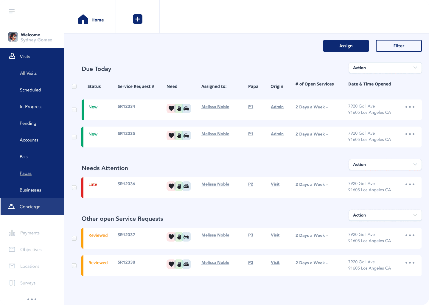
The Split-View Architecture

The Master-Detail layout was the load-bearing decision of this redesign. Once we committed to it, most other design questions resolved themselves. The left panel — fixed, always-visible — holds the patient profile: name, ID, status, contact method, language, and key dates. The right panel is the workspace. It loads sub-views (service requests, visit history, comments, status log) without displacing the context panel. Coordinators never lose orientation. They always know whose record they're in and what matters about that patient.

The Master-Detail layout was the load-bearing decision of this redesign. Once we committed to it, most other design questions resolved themselves. The left panel — fixed, always-visible — holds the patient profile: name, ID, status, contact method, language, and key dates. The right panel is the workspace. It loads sub-views (service requests, visit history, comments, status log) without displacing the context panel. Coordinators never lose orientation. They always know whose record they're in and what matters about that patient.

Status Encoding

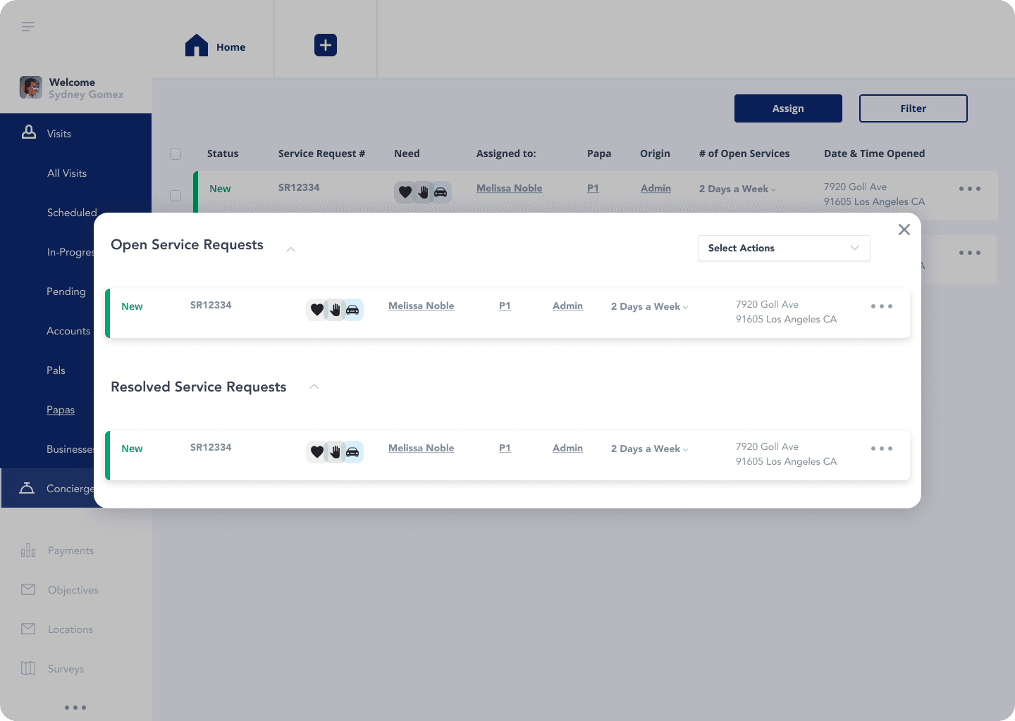
We established a three-tier urgency system with consistent visual encoding across all table views:

  • New — Green left border, green text. Active, unaddressed.

  • Late — Red left border, red text. Requires immediate attention.

  • Reviewed — Orange/amber left border, amber text. Actioned but open.

This encoding makes the most urgent row in any table immediately visible without reading. It's pre-attentive processing put to work — coordinators triage with their eyes before they engage with their hands.

The Service Request Creation Form

The creation modal follows a strict top-to-bottom decision hierarchy: type, then need, then description, then priority, then assignment. Each field gates the next conceptually, reducing decision paralysis. The "Assigned to" field uses a live-search dropdown — matching the concierge assignment interaction established elsewhere in the system for pattern consistency.

UI Kit Maturation

In parallel with the feature work, I built out the component variant library that the existing system was missing. This included:

  • Dropdown variants — Closed, open, item-hovered, item-selected — across all use contexts (request type, priority, concierge assignment)

  • Status badge variants — New, Late, Reviewed, In-Progress, Pending — with consistent color tokens and label conventions

  • Button states — Primary (Create, Assign), secondary (Cancel, Filter), and disabled states

  • Service Request row — With and without checkbox selection, with and without action overflow menu active

Every component was named to match the engineering team's existing token and component nomenclature. There was no translation layer between design and build. What the designer called it was what the developer referenced.

Outcome & Impact

After the launch, we saw Passkeys meet all of our set KPIs.

35%

Reduction in time-on-task for patient routing — measured against the legacy workflow

Coordinators no longer navigate away from a patient record to retrieve context. All decision-relevant data is surfaced within the persistent detail panel.

Coordinators no longer navigate away from a patient record to retrieve context. All decision-relevant data is surfaced within the persistent detail panel.

Eliminated pogo-sticking

Faster triage: Pre-attentive status encoding means urgent requests are identified visually before a coordinator reads a single row.

Faster triage: Pre-attentive status encoding means urgent requests are identified visually before a coordinator reads a single row.

Improved Triags

Doubled login success rate compared to the password model.

Design-dev naming parity meant zero component translation errors during implementation. What shipped matched what was designed.

Cleaner handoff

Doubled login success rate compared to the password model.

Qualitative feedback from the care team reflected a consistent theme: the new interface felt like it was built for the job. Fewer errors, less re-work, greater trust in the tool. When an interface behaves predictably and surfaces the right information at the right moment, it doesn't just save time — it builds the kind of quiet confidence that makes high-stakes work feel manageable.

Coordinator confidence

Doubled login success rate compared to the password model.

Lessons Learned

Persistent Context Is a Feature, Not a Layout Choice

The split-view wasn't a stylistic preference — it was a direct response to a measurable workflow problem. Every architectural decision should trace back to a user behavior. When it does, the rationale is self-evident and the solution is defensible.

The Design System Is Part of the Product

Shipping polished screens without a mature component library is a short-term win with long-term debt. Investing in variant architecture, naming parity, and interaction logic at the component level compounds over every subsequent sprint. Quality at the system level builds trust at the product level.

Information Density Requires Editorial Discipline

The coordinator persona needs rich data — but richness without hierarchy is noise. The most important design decisions on this project weren't about what to add. They were about what to surface first, what to keep one click away, and what to trust the user to find when they need it.